Website redesign to improve usability and accessibility for adult learners.
The previous site's structure and content issues limited usability for adult learners
[Project Overview]
Complete overhaul of the SVAEC website, including restructuring content, clarifying navigation, modernizing the visual system, and improving accessibility for adult learners across partner schools.
[Problem Statement]
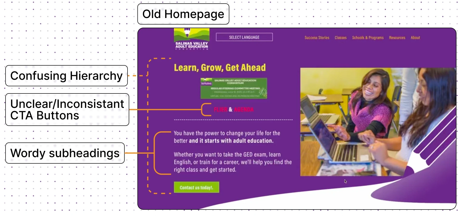
When we first looked at the SVAEC website, it was clear the information people needed was technically there, but almost impossible to actually find.
The site was full of outdated content, broken links, and long paragraphs that made navigation overwhelming, especially for the audience who relied on it most: adult learners, many from older age groups and with varying literacy levels.
[Goals & Objectives]
Going into the project, our team aligned on a few core goals to guide every decision:
- Simplify navigation to help learners easily find programs, and resources.
- Improve scannability by chunking content and using clear visual hierarchy.
- Add prominent CTAs guiding users step-by-step toward enrollment.
- Refresh the visual identity to feel modern, welcoming, and on-brand.
[Project type]
Web Design[My Role]
Lead Designer[Platforms]
Desktop and Android[Timeline]
January 2024 – March 2024[Tools]
[Persona]
Maria Hernandez
Restaurant Server
I want to go back to school, but I don’t want to feel lost trying to figure it out.
[Goal]
Find a class that fits her work schedule.
Understand enrollment requirements without needing to call multiple offices.
Improve her skills to qualify for higher-paying jobs.
[Frustrations]
Overwhelmed by dense text and unclear instructions.
Difficulty understanding which school offers which program.
Confusion around enrollment steps, and deadlines.
[Research Process]
Guiding Questions
Before we made any decisions, we wanted to deeply understand what learners were struggling with. To guide the redesign, we focused on answering three core questions:
Who are our users? (age range, tech comfort levels)
What information do they care about most?
How easily can they navigate the current site to find it?
Research Methods
To answer these questions, we used a survey research:
Quantitative Survey (58 learners):
We collected responses through a Google Form that asked learners about their age range, what information they prioritize, and how easy the current site is to navigate:


Key Findings
As we dug into the data, a few things stood out:
- Age + Tech literacy: Our users span a wide age range, with most between 35–54 and many 55+, which meant we needed to keep things simple, structured, and tech-friendly.
- Clear information priorities: Users cared most about course info, followed by career exploration and resources/services.
- Navigation barriers: Dense text, unclear hierarchy, and hidden CTAs made it hard for learners to find what they needed or complete tasks.
[Our Solution]
Guided Simplicity
Our goal wasn’t to just “make it look better.” We wanted to create a site that truly supported learners, guiding them, not confusing them.
We rebuilt the SVAEC website around a simple idea:
Help users find what they need in as few steps (and as little text) as possible.
This meant reorganizing content, restructuring pathways, reducing cognitive load, and redesigning patterns that would support the way adult learners actually browse.
The result is a modern, intuitive, and accessible website that helps learners move from curiosity ➡ clarity ➡ action without feeling lost.
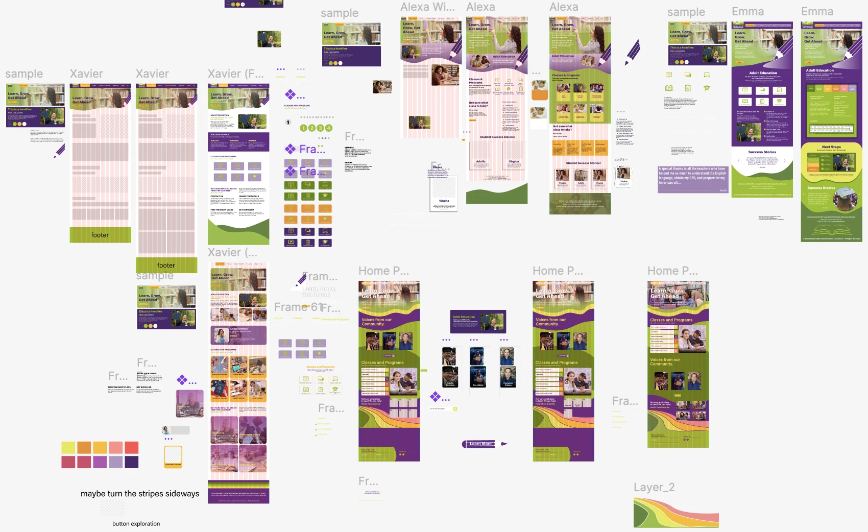
Visual Direction
Once we aligned on the research and structure, we explored multiple visual directions.
My team and I developed four style tile options to help the client choose the tone that best reflected the organization from typography and color all the way down to the feel of the site.
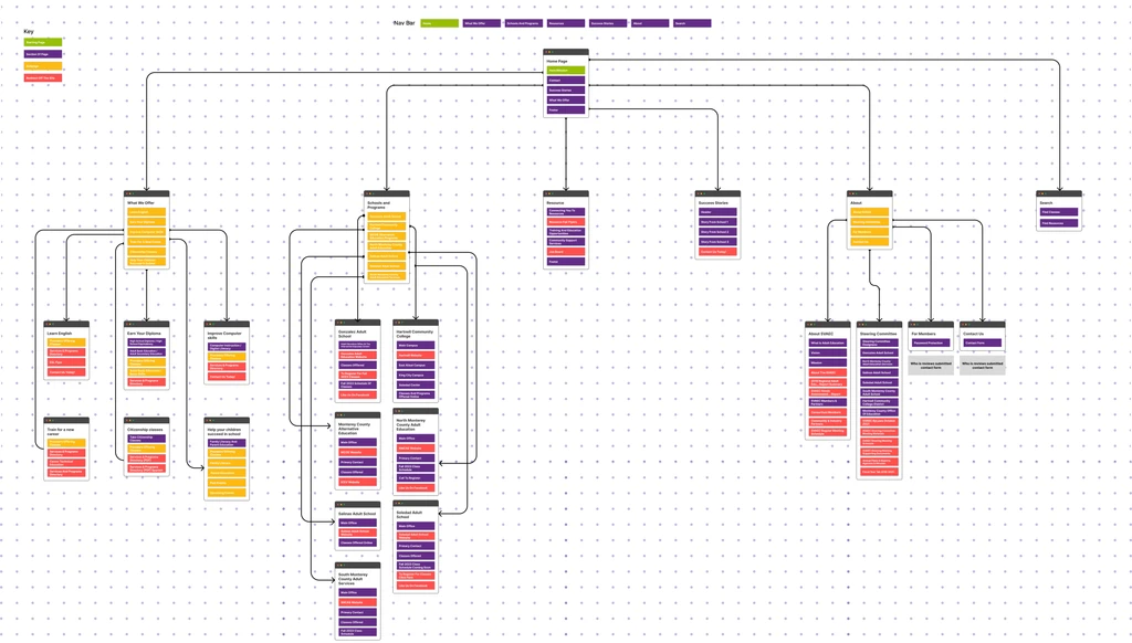
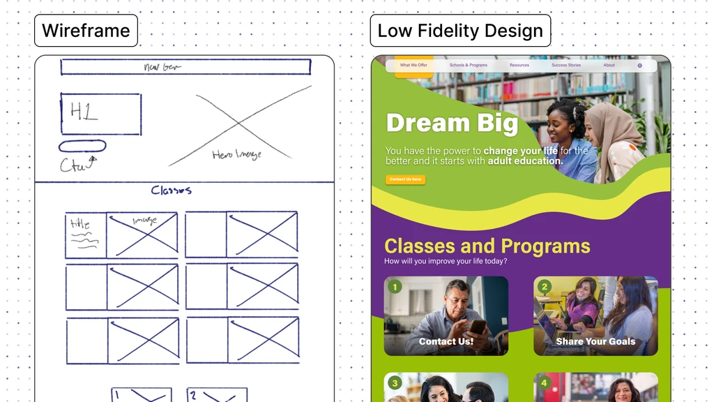
Wireframes/Lo-Fi Designs
With the sitemap finalized, I guided my team through building low-fidelity wireframes that focused purely on structure, content flow, and usability. We shared these with the client early to make sure everyone was aligned before moving forward.
These conversations helped catch potential issues before we invested time in polish and ultimately made the hi-fi phase much more efficient.
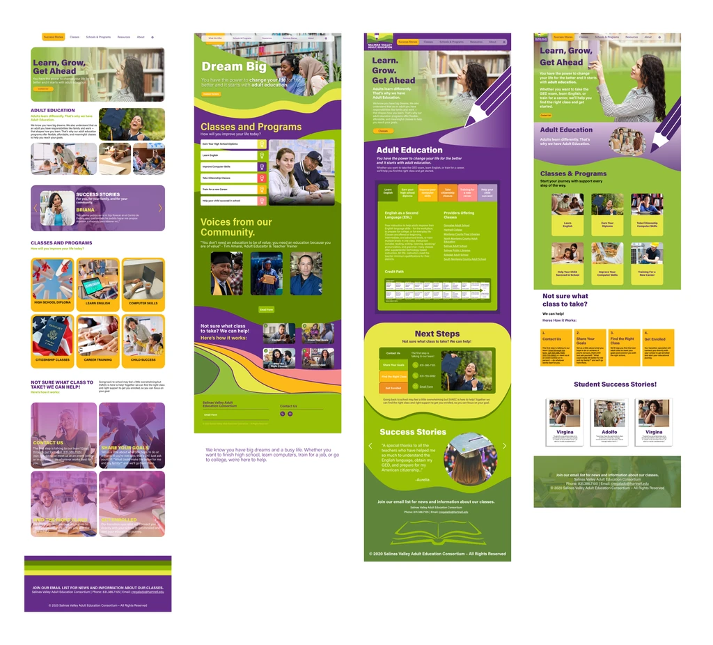
Hi-Fidelity Designs
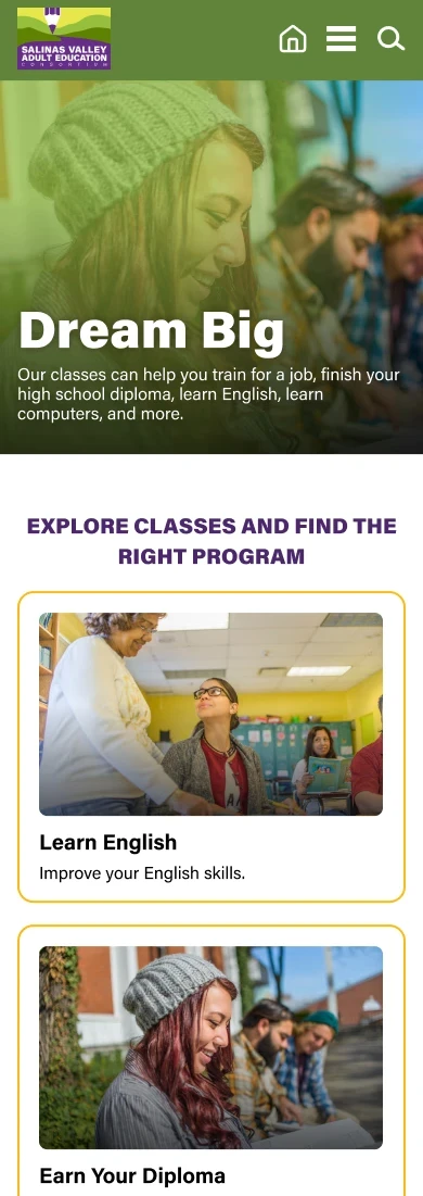
Once lo-fi layouts were approved, we created the high-fidelity designs for both web and mobile. These included refined typography, accessibility improvements, and updated layout patterns. We iterated closely with the client to incorporate feedback while keeping usability at the center.
[Site Improvements]
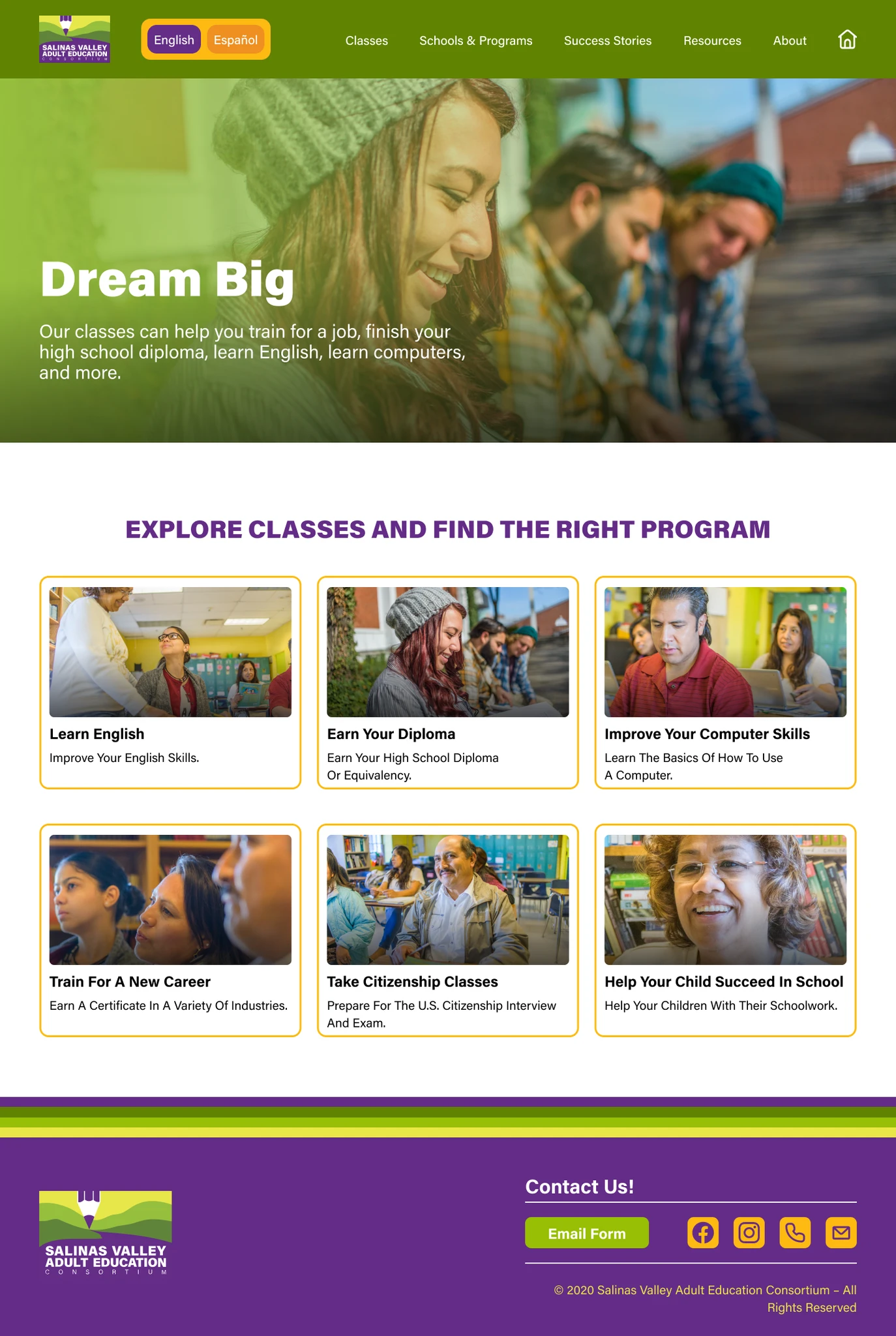
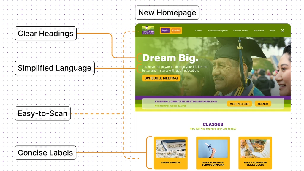
Improved User Flow
We reordered the landing page and introduced large, visual pathways that make the site easier to use for learners with varying reading abilities.
Users can now browse classes visually, see which schools offer them, and quickly jump to the correct enrollment page, all in a logical, step-by-step flow.
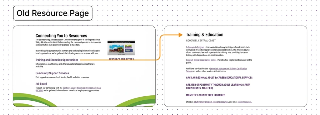
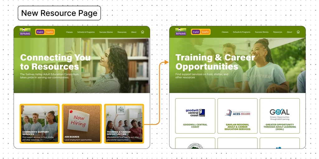
Resources
We centralized essential information programs, partner schools, and resources into a clean, scannable structure.
The old site depended heavily on scattered PDFs and broken links.
The new site makes everything discoverable in just a few clicks.
Components
We designed reusable components with clear titles and images. They make the site easier to scan, and more consistent.
This was especially important for users with lower literacy levels who rely on visual cues to navigate.


[Results]
Impact in Action
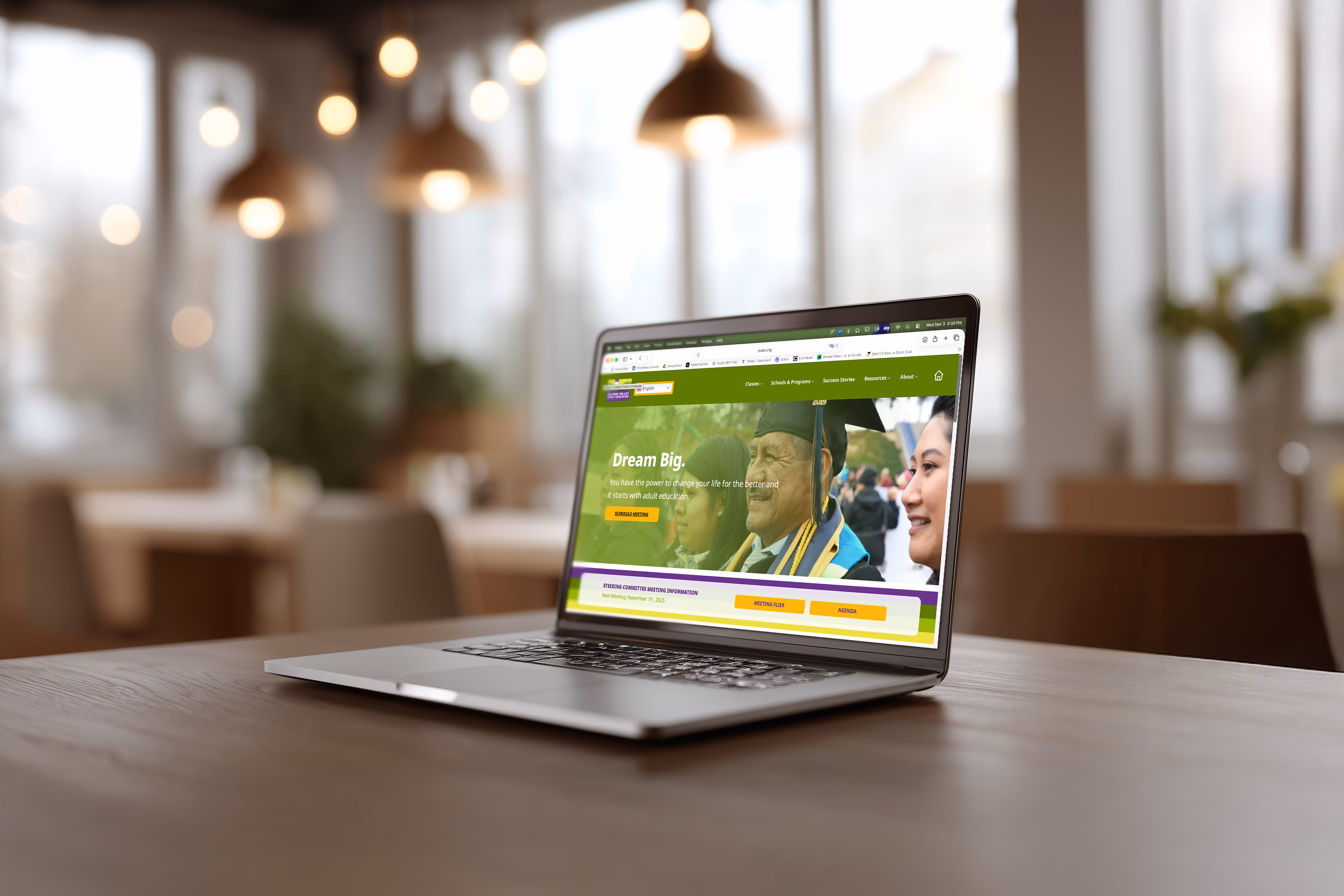
The client loved the new look, clean, modern, and still true to their brand. They were so happy with the outcome that they even asked about future work with our team.
Internally, our quick task tests showed clear improvements: learners could find classes and find resources much faster thanks to the simplified flow. Mobile navigation, which had been a major struggle before, became straightforward and easy to use.
Overall, the redesign made the site feel lighter, more modern, and far more supportive of the learners who rely on it.